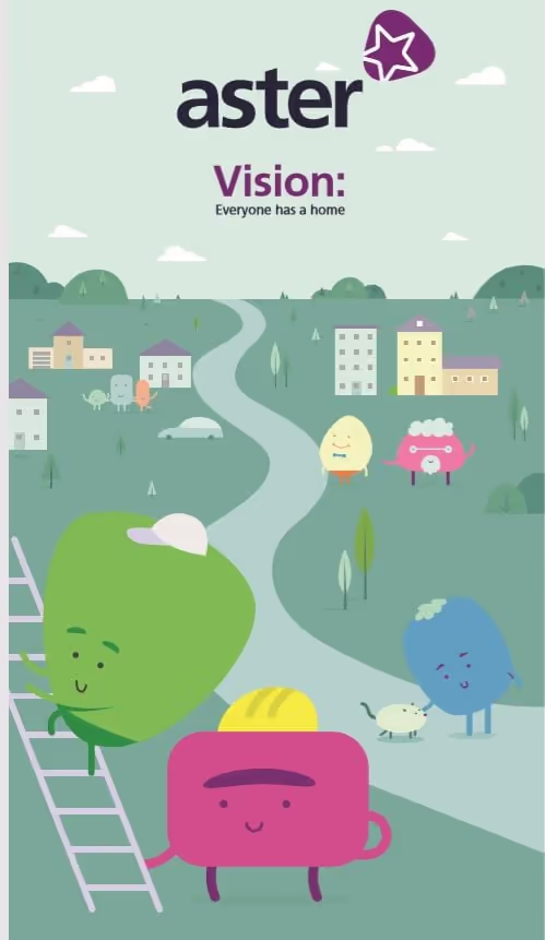
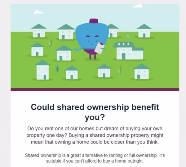
We began by designing a new suite of graphics and illustrations to inject personality into Aster’s communications. The illustrations featured characters, scenery, and icons, demonstrating key community elements including different ages, pets, professions, and house styles. They were formed from the original Aster logo’s plectrum-shaped icon, creating a cohesive brand identity.
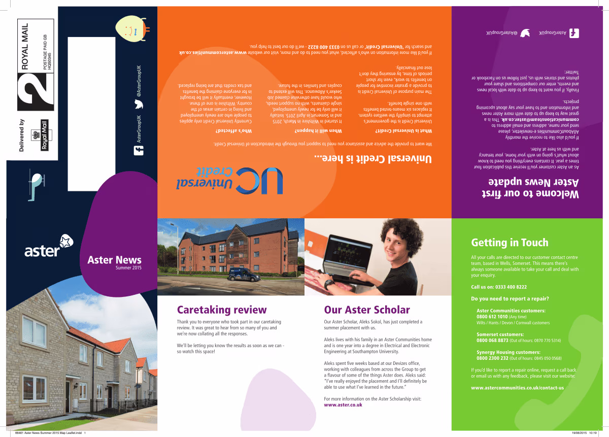
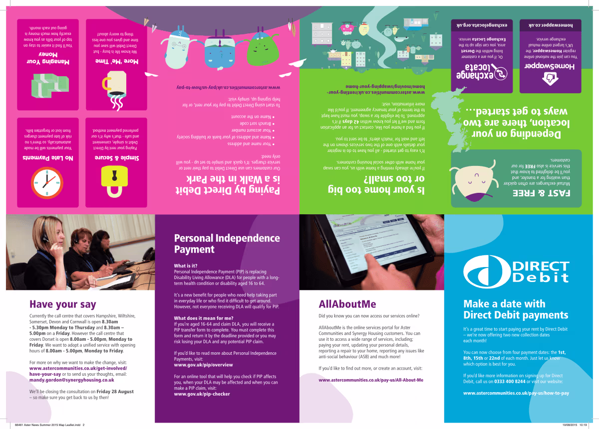
While reducing overall print volume, we established that some printed material was still needed for residents. Instead of magazines, we created quick-reference materials with key information designed to encourage retention. These folded to A6 size for posting through doors, containing topical information, quick access to phone numbers, and relevant updates, drastically reducing costs while maintaining physical touchpoints.
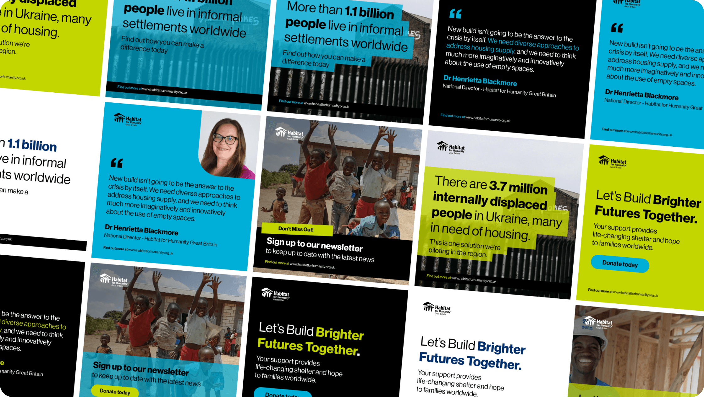
We incorporated the new illustrations into infographics for both internal communication (strategy documents) and resident-facing topics, including Universal Credit, Managing Money, Reporting Community Issues, and Direct Debits. These were informative yet lighthearted and easy to digest, distributed via monthly email newsletters, website, and broken into social media graphics for Facebook and Twitter, reaching residents who missed emails or post.
We created flexible HTML email templates with modular blocks for quick newsletter creation, tested extensively for mobile and desktop. Built and deployed via Campaign Monitor to Aster’s considerable resident database with positive feedback. Facebook and Twitter distributed key information based on newsletter and infographic themes. Regular posts and a responsive social media approach dramatically improved engagement, with more residents choosing to interact online.