
Updated 2nd September 2026
How better UX can increase charity donations
Charity teams are stretched. Budgets are tight, expectations keep climbing, and the pot of money being given away is getting smaller. The Charities Aid Foundation found that the British public gave around £14 billion in 2025, down from £15.4 billion the year before, a fall of nearly 10%. Over the past decade the share of people donating at all has slipped from 69% to 55%.
That is a difficult backdrop for anyone responsible for fundraising. But there is a more hopeful way of reading it. Every day, people arrive on charity websites already wanting to help. They have seen a campaign, heard about a cause from a friend, or gone looking for somewhere to put their money after a tough news story. The intention is there. What often gets in the way is the website itself.
Good design and user experience will not manufacture generosity. What it will do is stop avoidable barriers from getting between a willing supporter and the donate button. Here is where we usually see the biggest gains.
First impressions happen faster than you think
People decide whether they trust the look of a website almost instantly. Research from Carleton University found that visitors form a visual impression of a page in around 50 milliseconds, well before they have read a word of your copy. The Stanford Web Credibility Project put numbers on what that means for trust: 46.1% of people said they judged a site's credibility partly on its overall visual design.
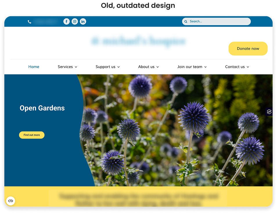
For a charity, that first half-second is doing a lot of work. A clean, current design signals a well-run organisation. A cluttered or outdated one, however brilliant the work behind it, plants a quiet doubt about whether the money will be handled well.
A few things consistently help:
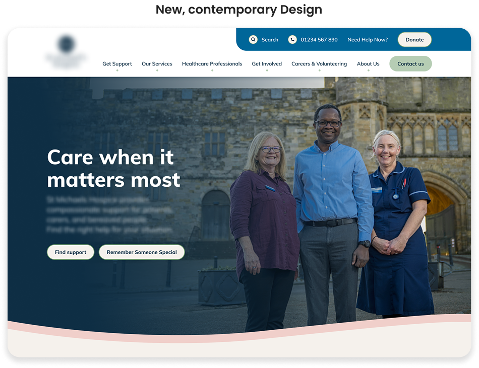
- Real imagery over stock photography. Photographs of your actual people, places and beneficiaries create emotional connection. A generic smiling stock model does the opposite, because most people can spot one instantly.
- A clear mission statement, high up. Visitors should understand who you are and what you do without scrolling or hunting.
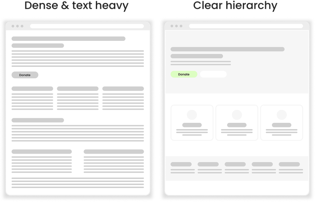
- Room to breathe. Space, clear hierarchy and a small number of well-chosen images beat a homepage trying to say everything at once.
Every extra step is a chance to lose someone
Deciding to donate and completing a donation are two different things, and quite a lot can happen between them. Someone gets interrupted. The form asks for a phone number they would rather not give. A page takes a moment too long to load and the impulse quietly passes.
Every additional field, click and page is another opportunity for that to happen. The most useful exercise is to sit down and complete your own donation journey, start to finish, counting the steps as you go. Most teams are surprised by the number.
What to look at:
- Cut the form back to what you genuinely need. If a field is not required to take the payment or claim Gift Aid, question whether it belongs there at all.
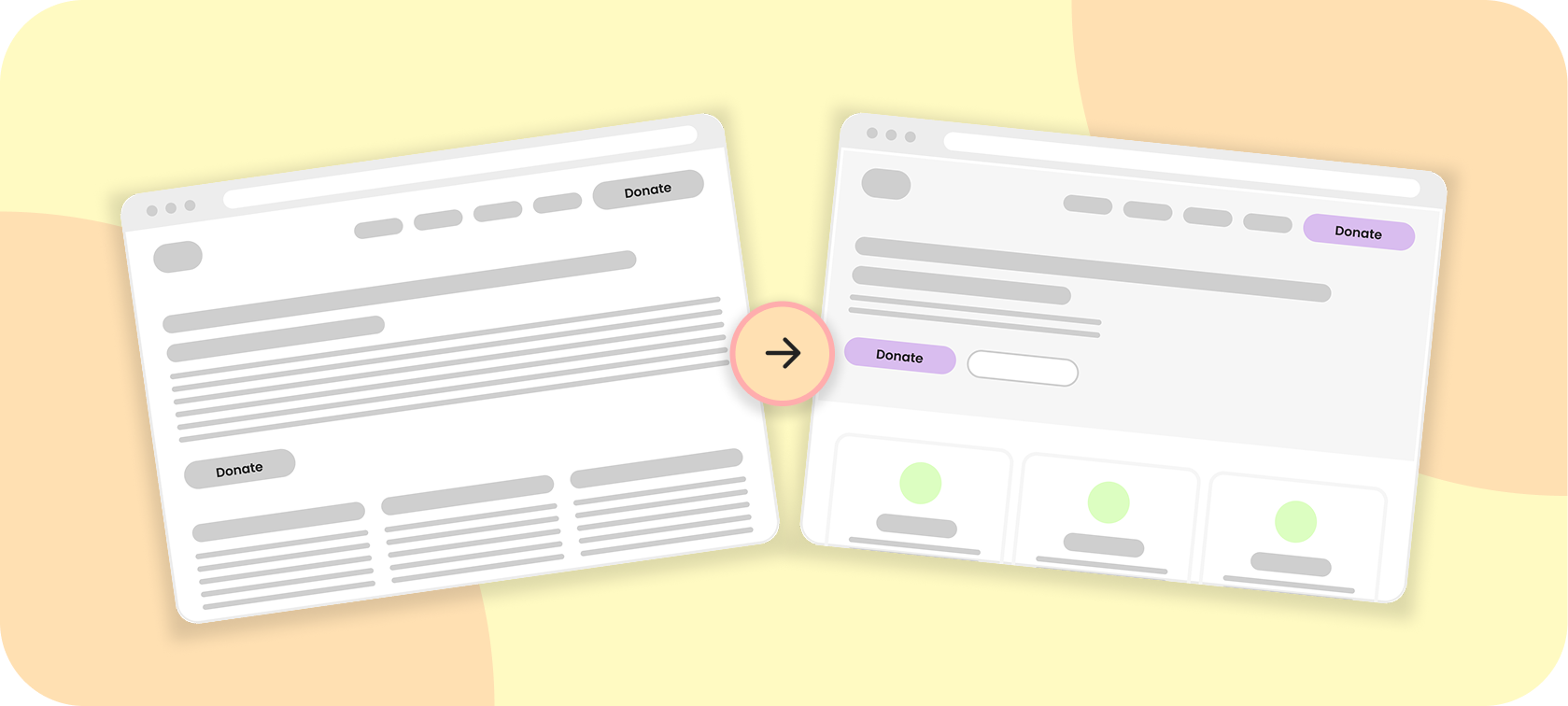
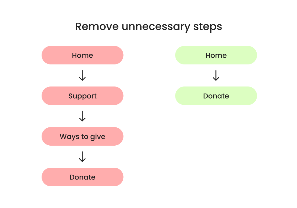
- Shorten the path. Instead of Home > Support Us > Ways to Give > Donate, make it Home > Donate. Keep a visible donation call to action in the header on every page.
- Show progress on longer forms. If you do need several steps, a progress indicator tells people how much is left, which makes them far more likely to finish.
- Never force account creation before a one-off gift.
Mobile is where your supporters already are
Most people now meet your charity on a phone. They see a post on the train, click through from an email at lunchtime, or look you up after hearing about you from someone else. Yet for a lot of charities, the mobile experience is still the desktop site squeezed down to fit.
Look at your own analytics and you will usually find the same pattern: plenty of mobile visitors arriving, far fewer of them completing a donation. That gap is rarely about mobile users being less generous. It is about mobile donations being harder to finish.
Worth checking on a real phone, not just a narrow browser window:
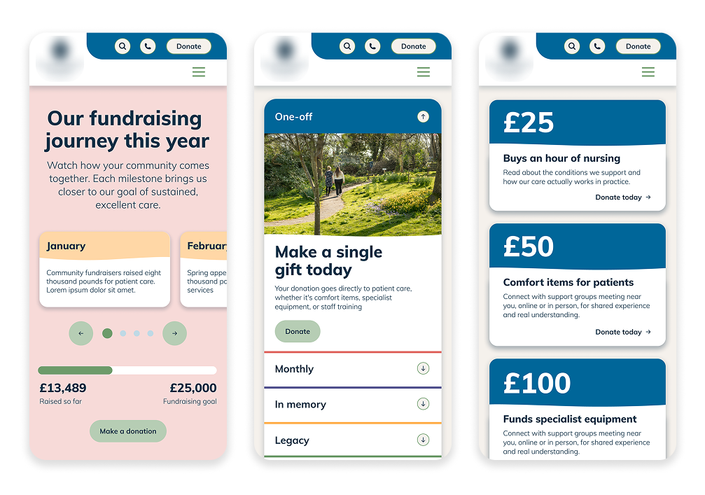
- Layouts that genuinely respond to small viewports rather than shrinking a desktop design.
- Tap targets large enough to hit comfortably with a thumb, with enough space around them that nobody hits the wrong one.
- Fast load times, particularly on a mobile connection rather than office wifi. Slow pages lose people before they have seen anything.
- Apple Pay, Google Pay and PayPal, which remove the need to type card details entirely.
- Autofill support on name, address and card fields, so the browser can do the work.
Accessibility is not optional
This should go without saying, but it still needs saying. WebAIM's 2026 analysis of a million home pages detected WCAG 2 failures on 95.9% of them, at an average of 56 errors per page.
For a charity, an inaccessible website is a particularly uncomfortable problem. The people most likely to be excluded are often the very people your cause exists to support. A WCAG-compliant site means more supporters can donate independently, without needing to phone someone or ask for help. It is the right thing to do, and it widens your donor base at the same time.
Check out our blog on accessibility to find out more on this!
Build trust at every step, not just at the start
Trust is not established once on the homepage and then assumed. It needs reinforcing right through to the confirmation page, because that is where the doubts creep in.
Design and UX can carry a lot of this quietly:
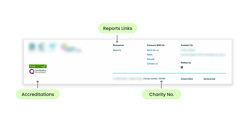
- Your registered charity number, clearly displayed
- Secure payment badges on and around the donation form
- Easy access to annual reports and accounts
- Impact statistics presented simply and honestly
- Testimonials, reviews and case studies from real supporters and beneficiaries
Make the impact tangible
"Donate £25" asks someone to give up money. "£25 provides a week of hot meals for a family" invites them to fund something specific. Same amount, completely different decision.
Wherever you present suggested amounts, pair each one with what it actually achieves. Then back it up with real beneficiary stories, told properly, with names and faces where you have permission. A single specific story will almost always move people more than a large number will.
Give people options for how they give
Not everyone wants to give in the same way, and someone who cannot commit to what you are offering will often give nothing rather than ask. Make the alternatives visible and easy to find:
- One-off donations
- Monthly or regular giving
- Corporate giving and partnerships
- Community fundraising and events
- In memory and legacy giving
- Gift Aid, presented as a simple tick rather than a paragraph of tax law
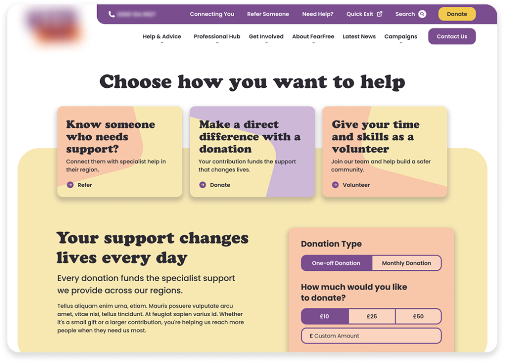
Monthly giving deserves particular attention. It gives you income you can actually plan around, and it is often a smaller ask than a single larger gift.
Say what you want people to do
Vague calls to action get ignored. Clear ones get clicked. Language like Donate today, Help someone now, Make a difference, Give monthly and Support our work does two jobs at once: it tells people what will happen next, and it connects the click to the reason they came.
Make those buttons look like buttons. Give them a colour that stands apart from everything else on the page, enough size and spacing to be obvious, and consistent placement so people stop having to look for them.
Reduce the thinking your supporters have to do
Every moment a visitor spends working out where they are or what to click is effort not being spent on your cause. Lowering that mental load is one of the most reliable ways to improve donations:
- Consistent layouts, so pages behave the way people expect
- Navigation that uses plain language rather than internal terminology
- A logical page hierarchy that matches how supporters think, rather than how your organisation is structured internally
- Plenty of whitespace and shorter copy, so the important things are easy to find
None of this is glamorous work. It is quietly transformative all the same.
The point of all this
Improving the design and UX of your website is not about persuading people to give more than they meant to. It is about making sure the people who already want to support you are not stopped by barriers you could have removed.
Build a site that is accessible, trustworthy, fast and easy to use, and you make it simpler for supporters to act on their generosity. That is what lifts donations.
Fancy a look at yours?
If you are not sure where your website is helping or hindering, we are happy to take a look and tell you honestly what we find. Our Charity Partner Scheme is free to join for UK charities and not-for-profits, and comes with practical support on things like Google Ad Grants, accessibility and website performance.
Send your brief or just chat through your ideas, no obligation or hard sell. Get in touch with the experts at Atelier Impact.
Sources
- Charities Aid Foundation, UK Giving Report 2026: https://www.cafonline.org/insights/research/uk-giving-report
- Lindgaard, G. et al. (2006), Attention web designers: You have 50 milliseconds to make a good first impression, Behaviour & Information Technology: https://www.tandfonline.com/doi/abs/10.1080/01449290500330448
- Stanford Web Credibility Project, Stanford Persuasive Technology Lab: https://en.wikipedia.org/wiki/Stanford_Web_Credibility_Project
- WebAIM, The WebAIM Million 2026: https://webaim.org/projects/million/